Sculpted by Light

CLIENT

LUMORA

SERVICES

Hospitality Branding


Translating Corfiot elegance into a contemporary sanctuary.


THE ORIGIN


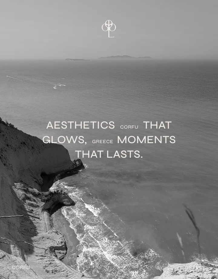
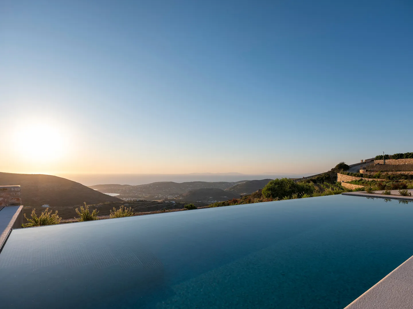
On an island defined by its deep Venetian history and distinctive elegance, Lumora was born with a different mission: to translate this heritage into a contemporary, mindful pause. Located in the southern axis of Corfu, our challenge was to digitally visualize the essence of a sanctuary, a place where guests experience luxury not through heavy, classical forms, but through the absolute absence of noise.


THE IDENTITY


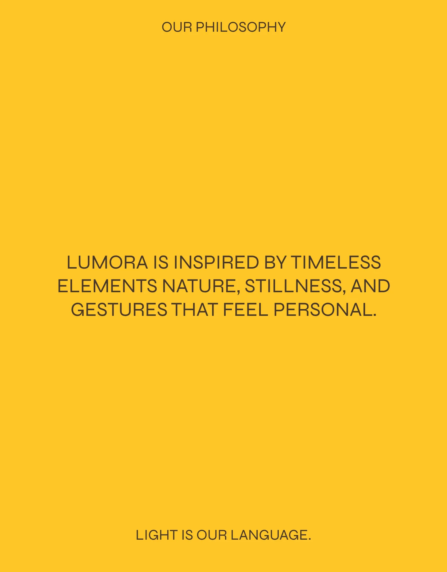
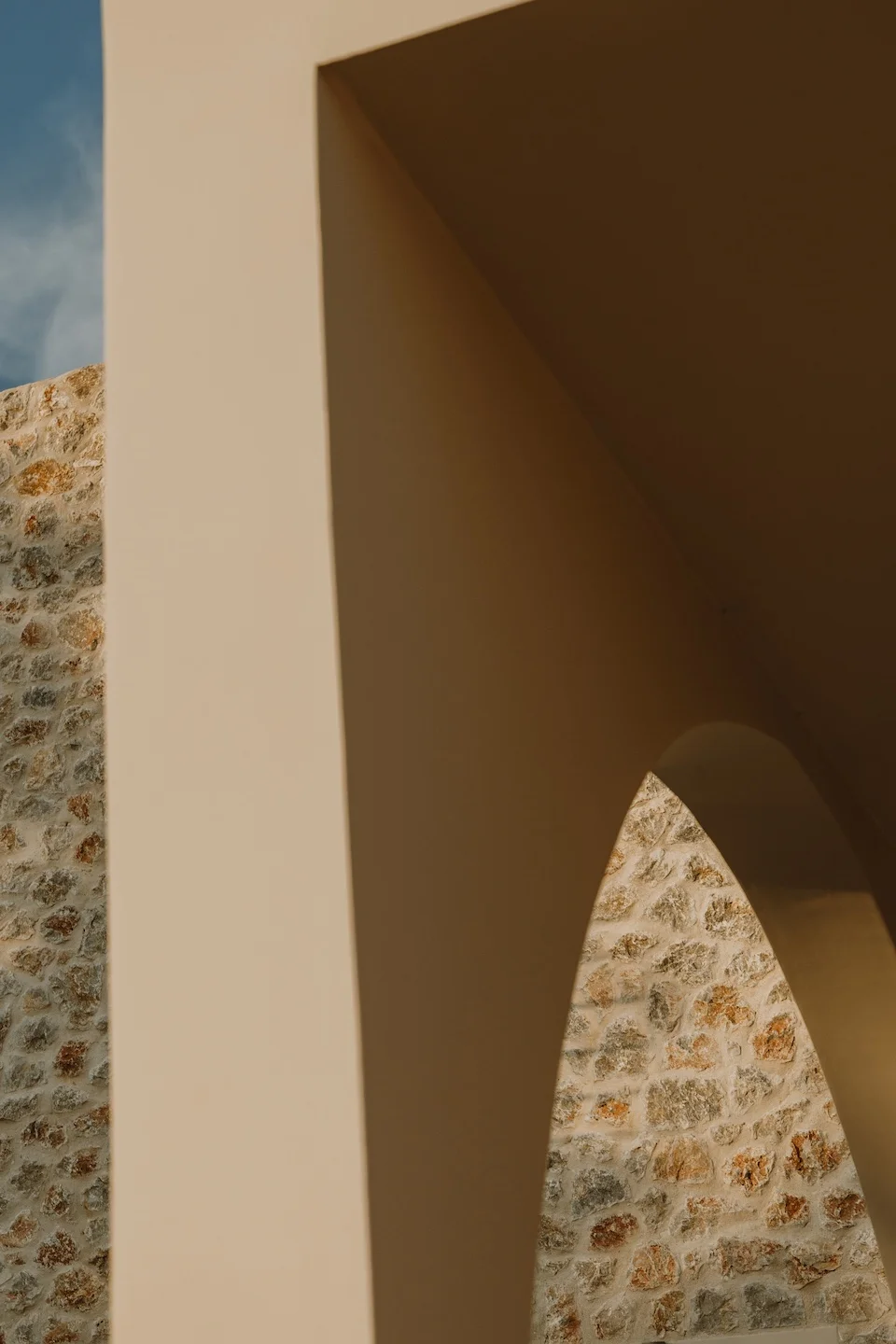
Everything began with the core essence of the space. The name “Lumora” fuses lume (the soft light that bathes the island) with aura (the serene, welcoming presence). Visually, the brand identity embraces this exact fluidity. We integrated the architectural curves into the design, selecting a visual language that truly “breathes.” Much like the minimalist, airy lines of its interiors, the brand was designed to exude warmth without any visual tension.
 

lumora corfu


THE VISUAL NARRATIVE


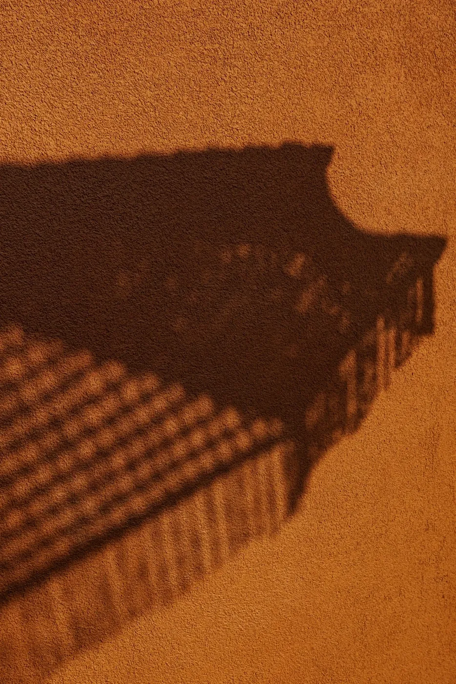
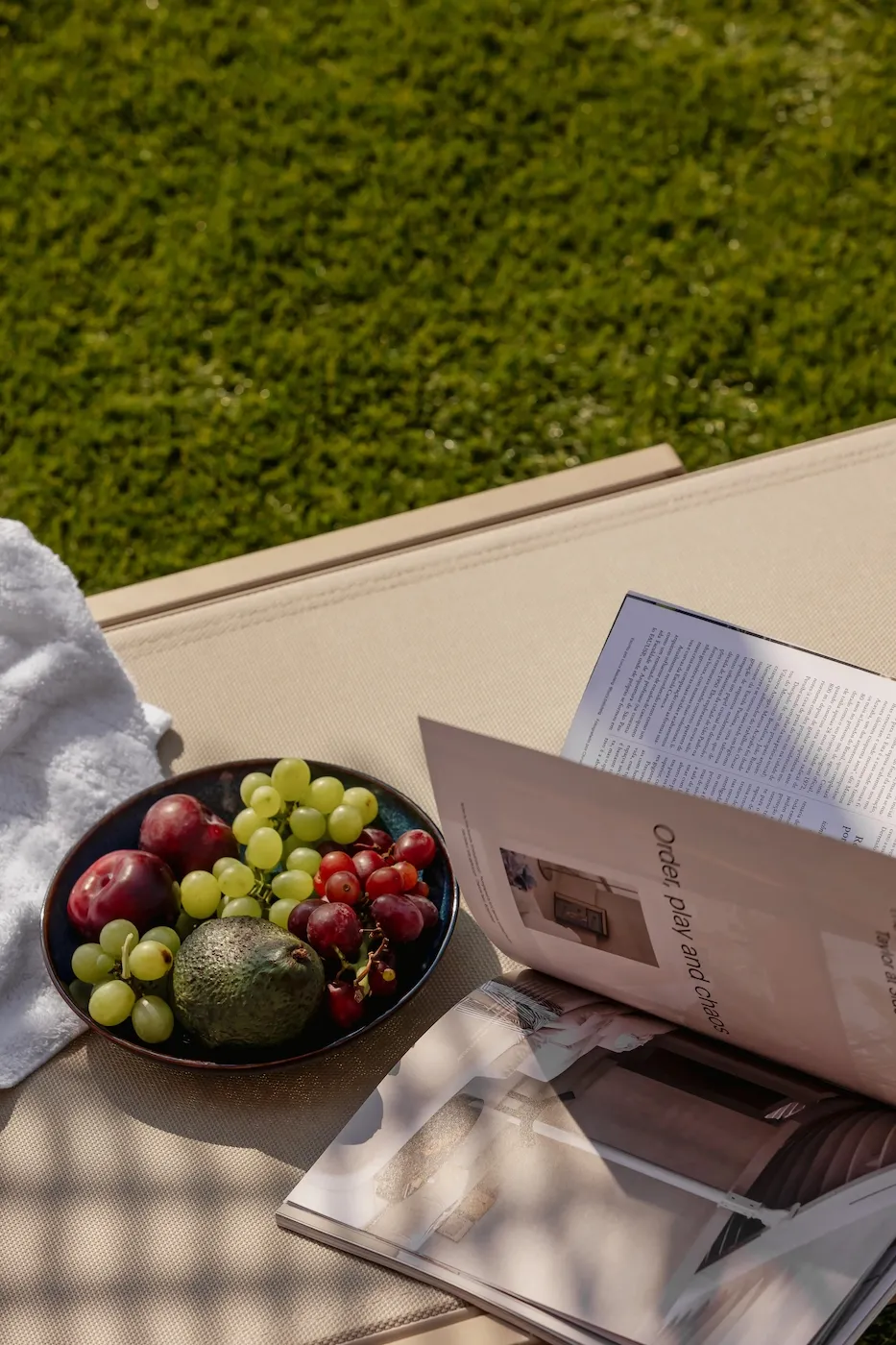
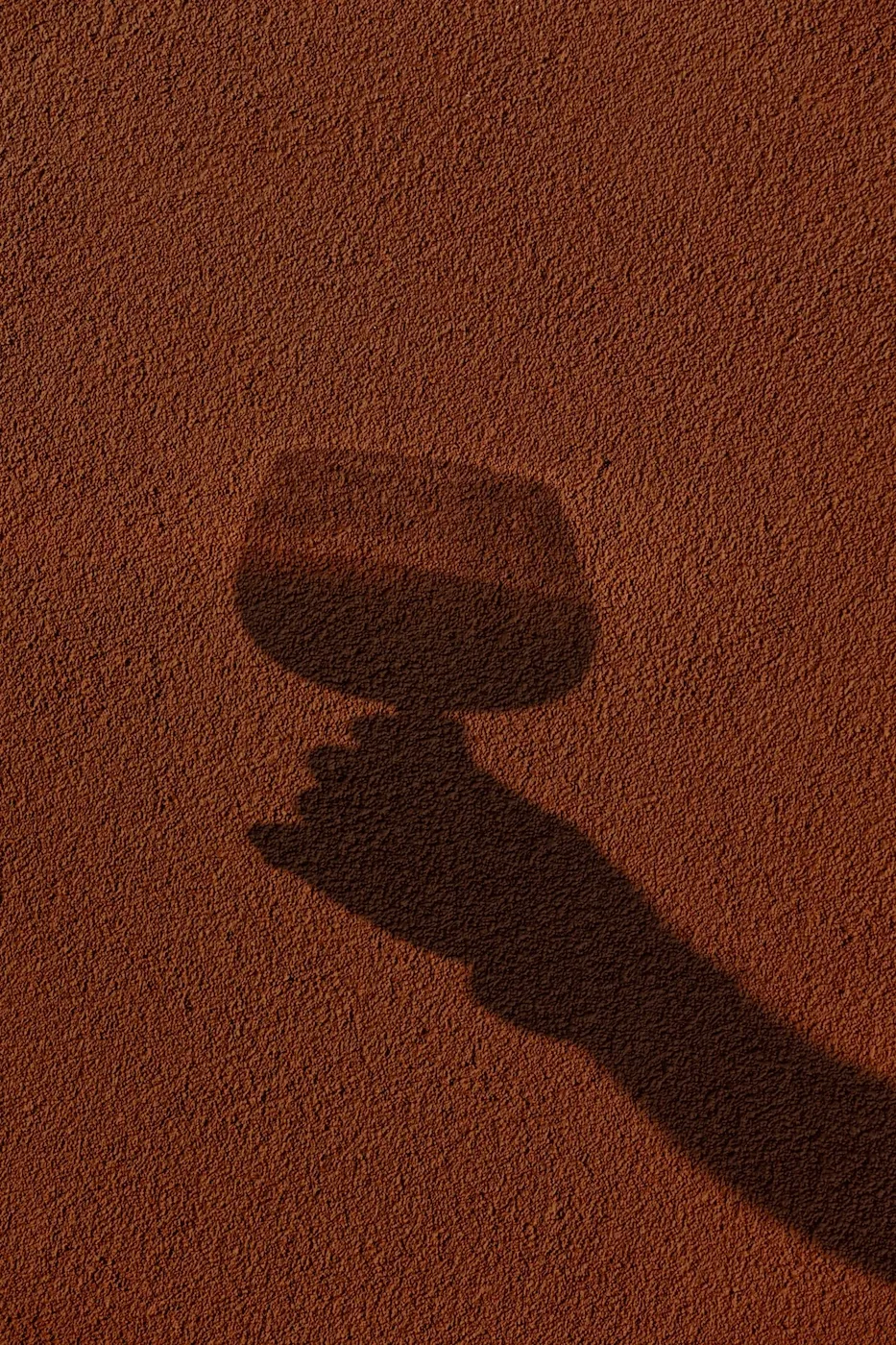
In our photography, we allowed the Ionian light itself to dictate the rhythm. Instead of staging sterile, over-illuminated shots, we captured texture and movement. We focused on the way a linen drape sways in the breeze, the shadows cast by olive leaves on stone, and the effortless nature of a sun-drenched terrace. We portrayed comfort as something entirely innate.


lumora corfu branding

THE TACTILE EXPERIENCE


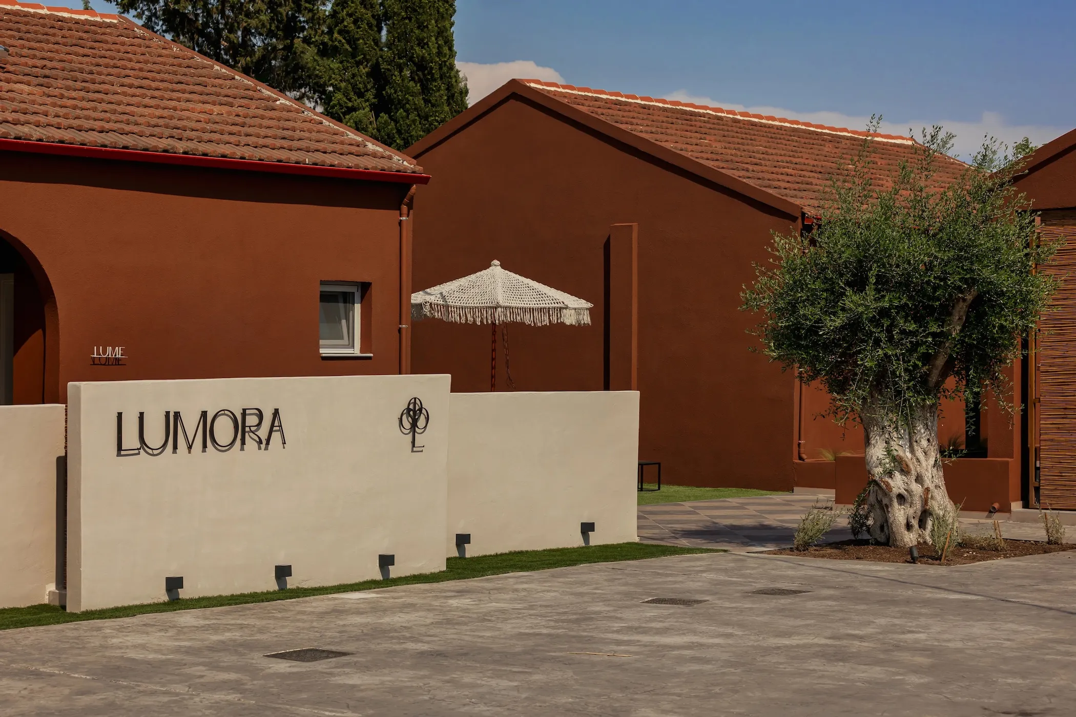
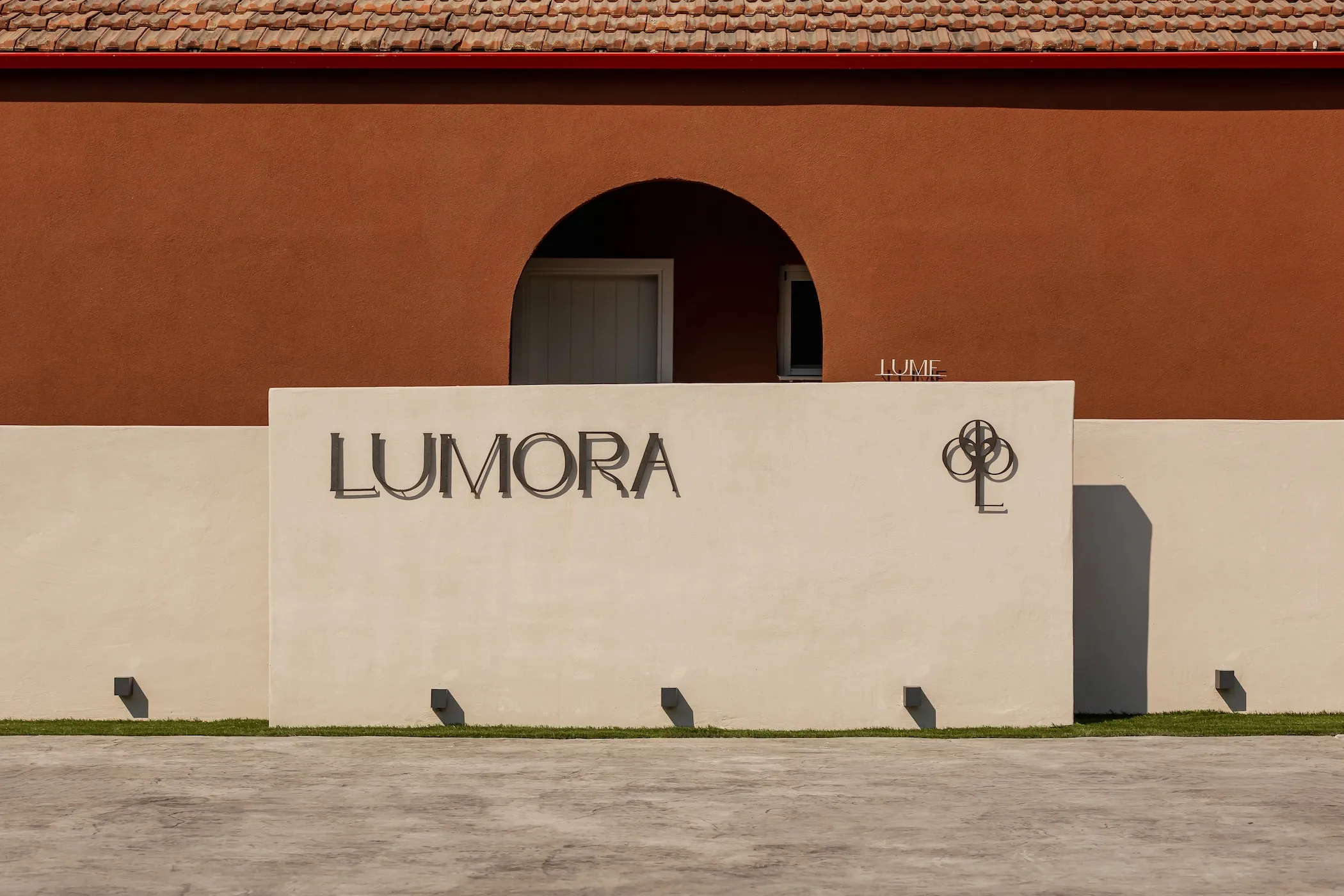
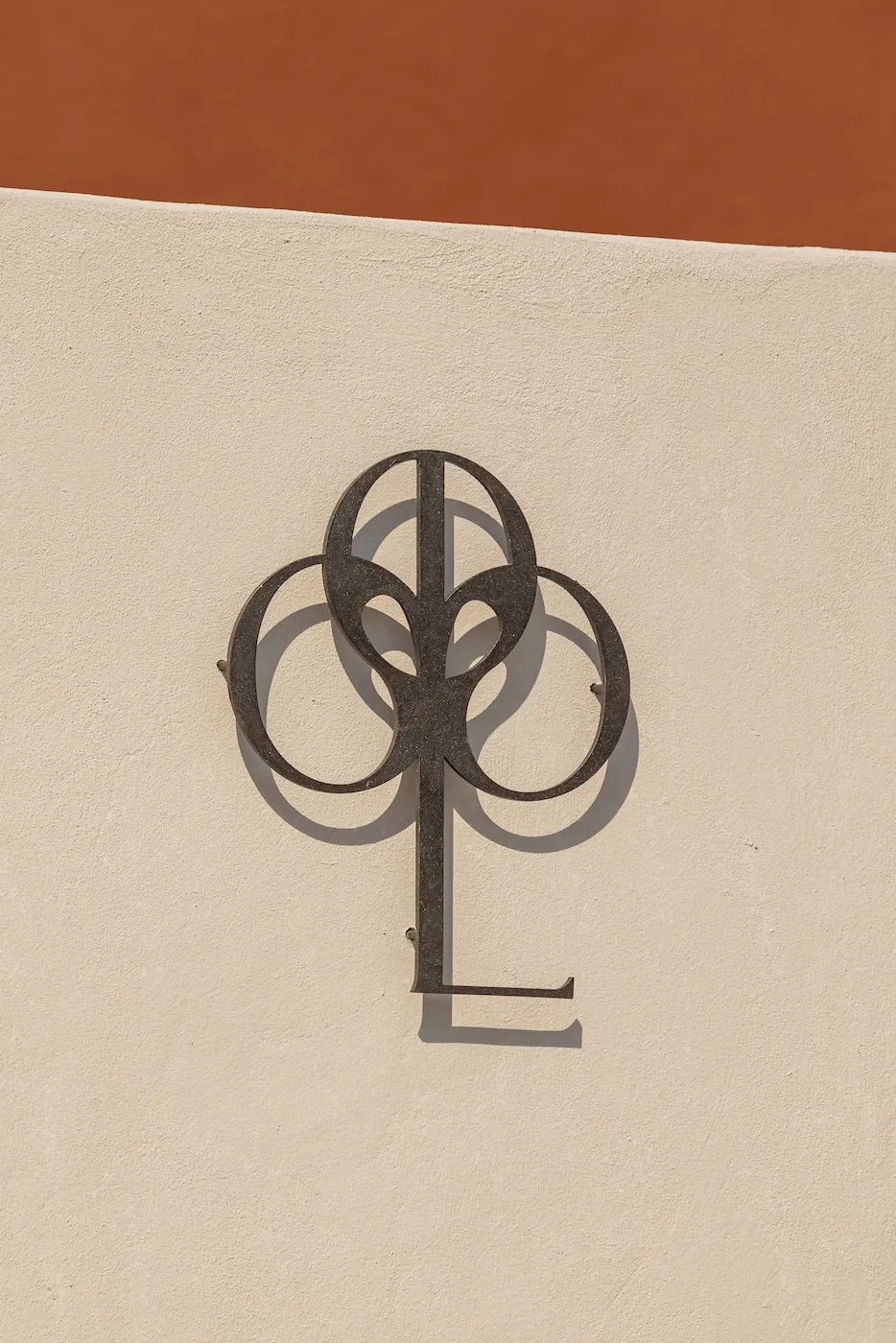
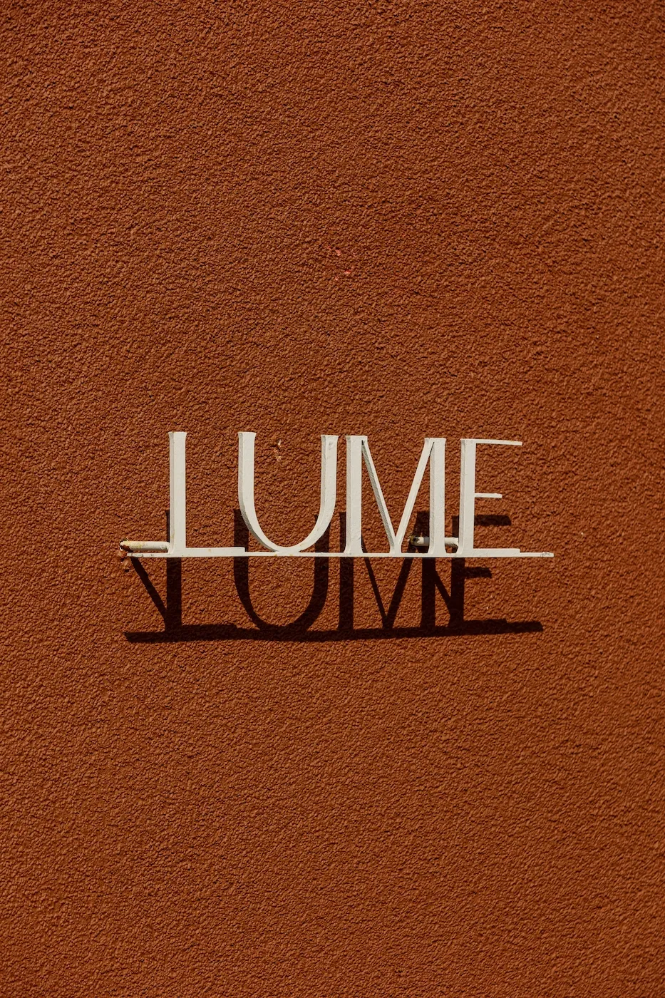
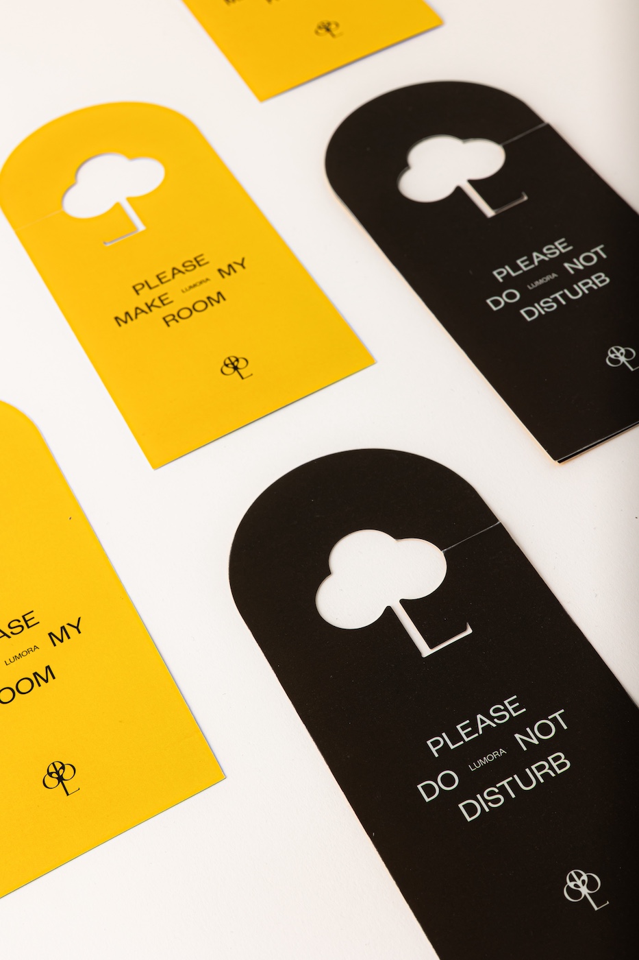
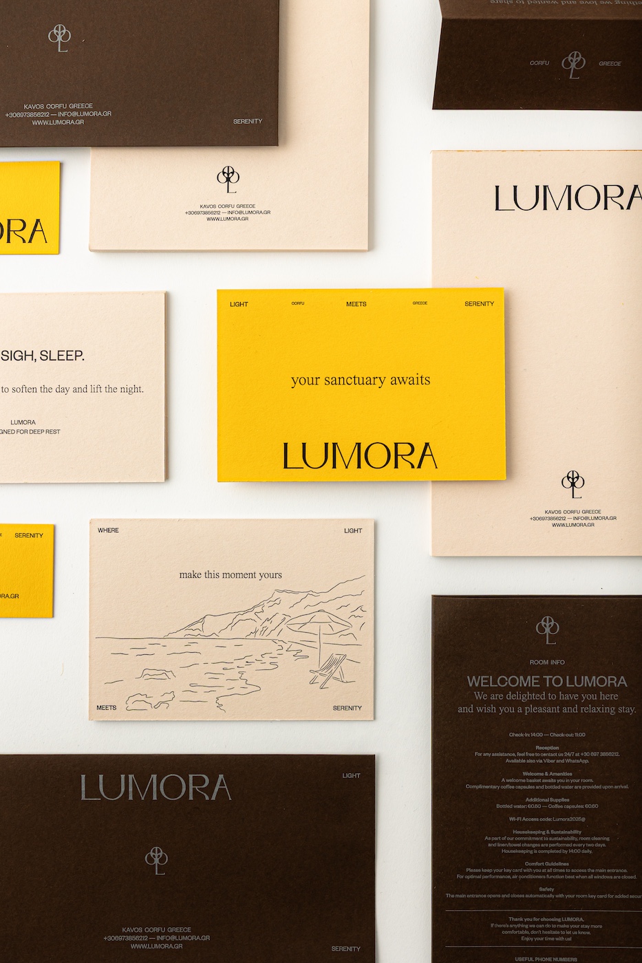
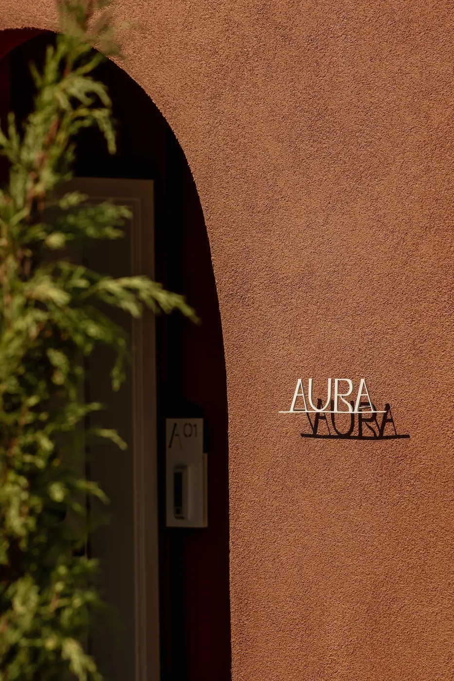
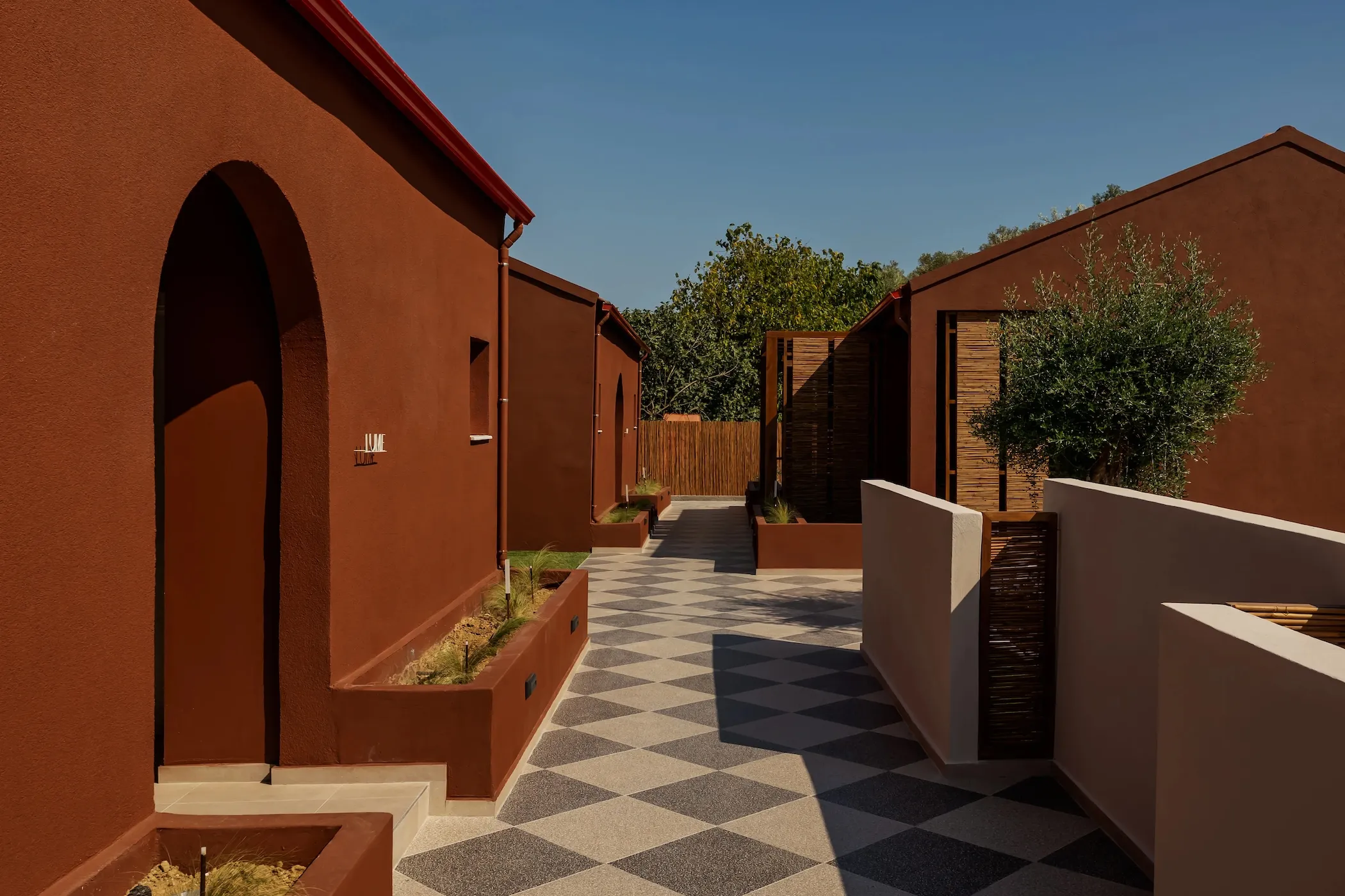
The brand’s philosophy had to acquire weight and texture within the physical space. The architectural signage was crafted from iron and mounted to float slightly off the walls. By doing so, the Ionian light itself completes the design, casting sharp, dynamic shadows that shift throughout the day. This grounded austerity of the metal is perfectly counterbalanced by the printed collateral. All materials, from welcome notes to door hangers, were printed on premium, matte specialty papers. Drawing from a palette of warm sun-yellow, deep brown, and sandy tones, we created a warm, organic feel that guests can actually touch, reaffirming the quality of hospitality with every interaction.


THE DISTINCTION


Lumora does not position itself merely as a holiday destination, but as a return to something profoundly essential. Through its cohesive brand image, it attracts guests in search of balance, inviting them to a place where elegance flows effortlessly, and the serenity of the Corfiot landscape can be felt even before the booking is complete.


VISIT LUMORA


NEXT CASE STUDY

ENQUIRY FORM

Start Your Project

Project Form EN