Visualizing the Art of Serenity

welldesigned photography art direction

CLIENT

HOOGA


Building a destination from the ground up: Translating a feeling into a brand identity.


THE GENESIS


As a brand-new project, Hooga required positioning on a blank canvas. The word “hygge” encapsulates an entire philosophy: warmth, coziness, and the joy of being present. The challenge, therefore, was not merely to introduce another hospitality brand to the market, but to find a way to visualize this abstract concept. How do you establish a sense of tranquility from day one, before a guest even arrives at the destination?


hooga branding by welldesigned

THE IDENTITY


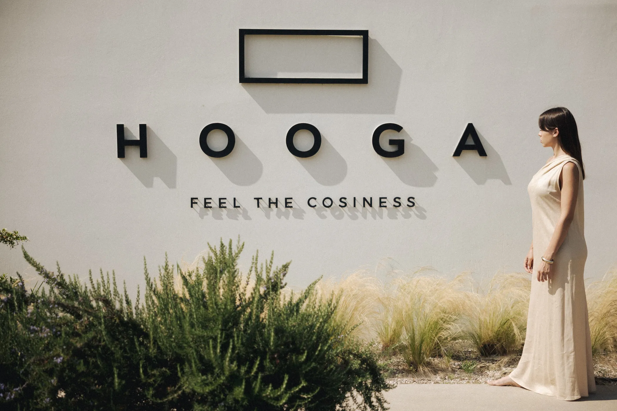
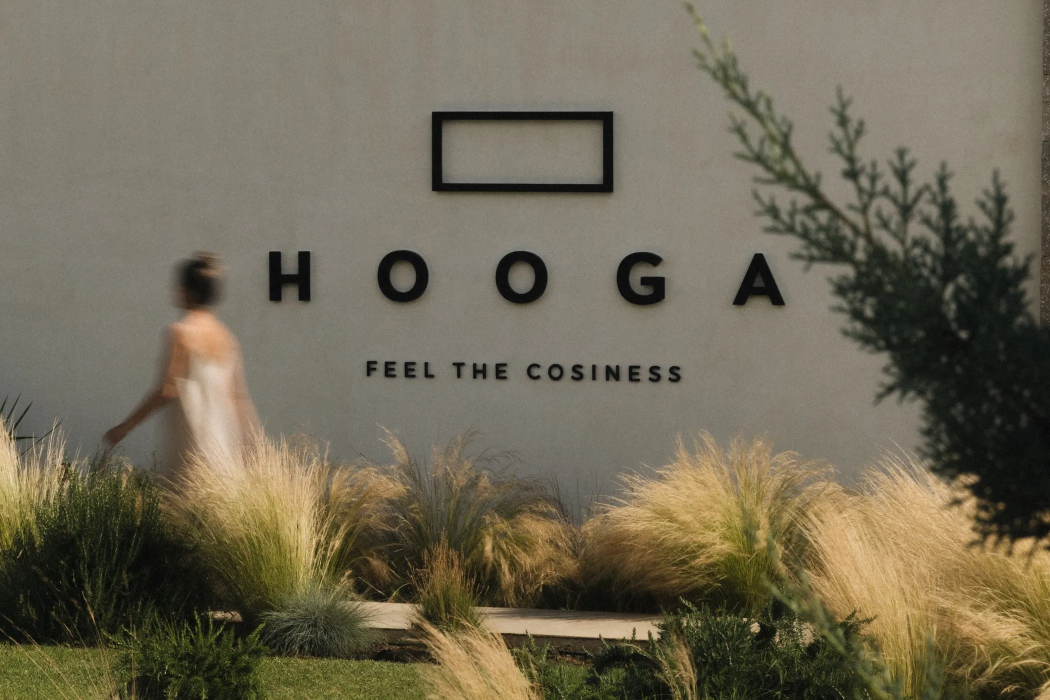
We steered clear of any superfluous design elements. The goal was to convey the essence of warmth through absolute abstraction. We opted for clean, minimalist sans-serif typography paired with a strict black-and-white color palette. Stripped of visual “noise” and color, the identity breathes through its contrasts, allowing the hospitality experience itself to take center stage. Every line was crafted to act as a welcoming, subtle invitation.
 

σήμανση ξενοδοχείου hooga

THE VISUAL NARRATIVE


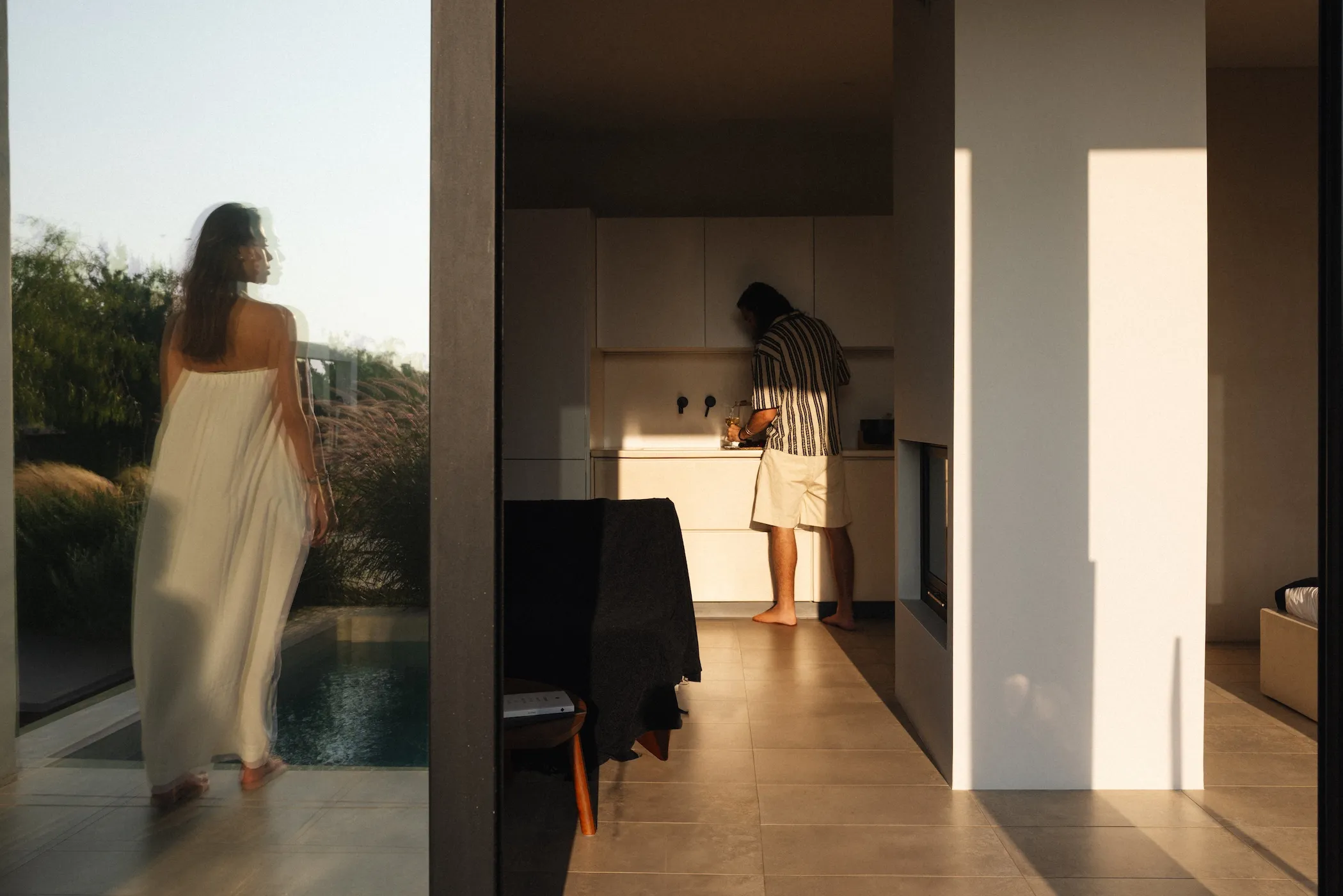
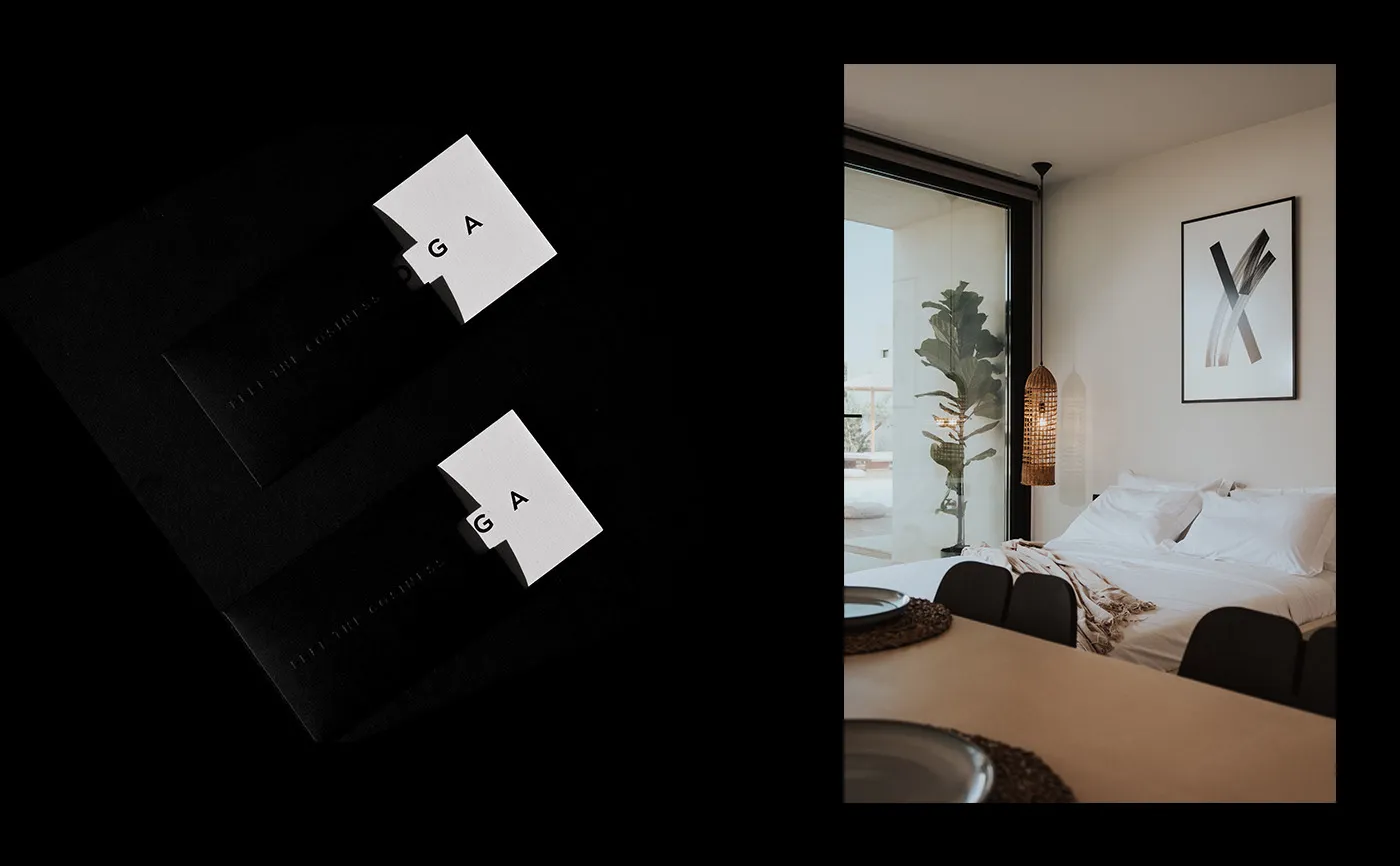
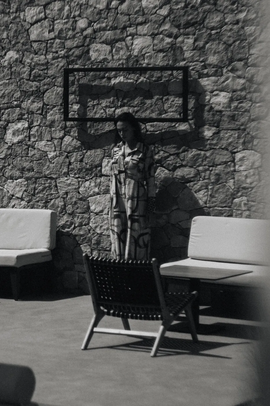
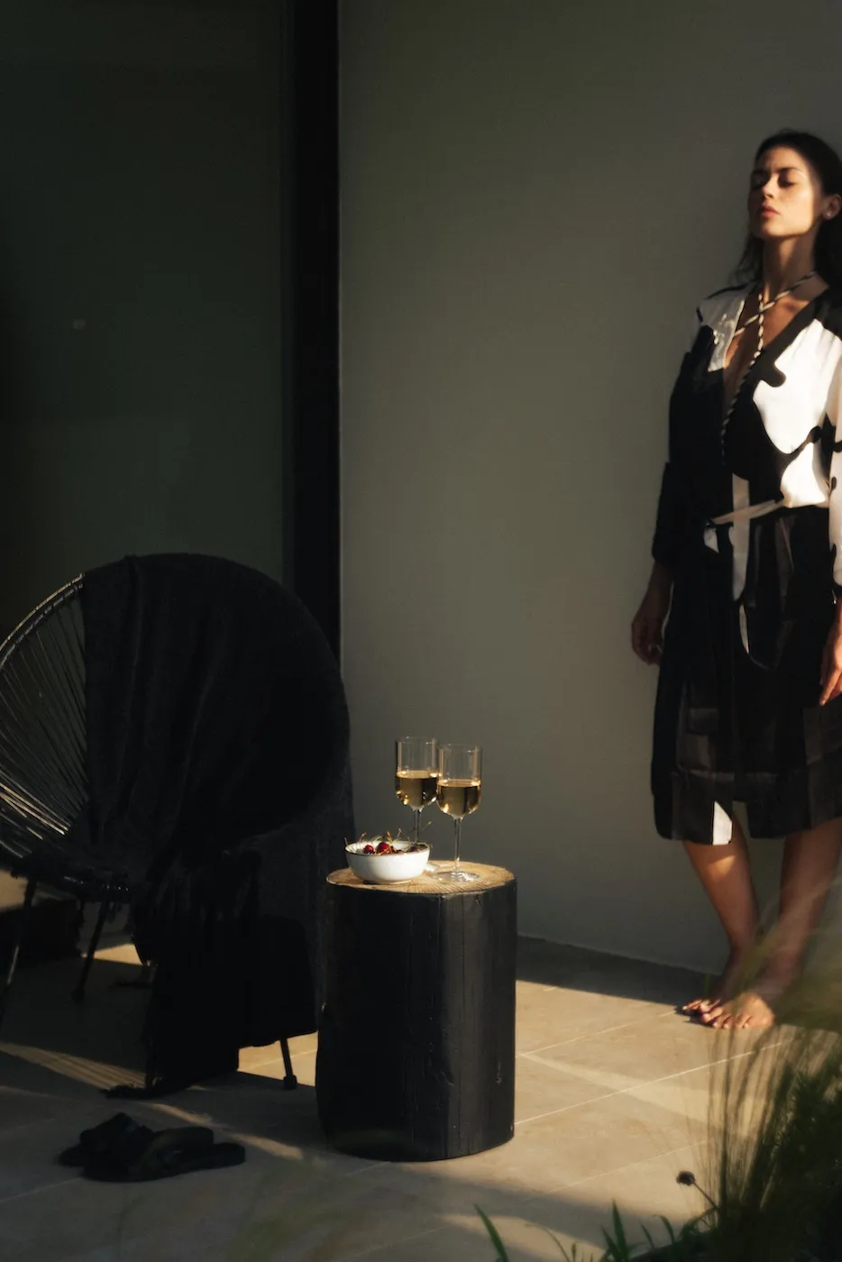
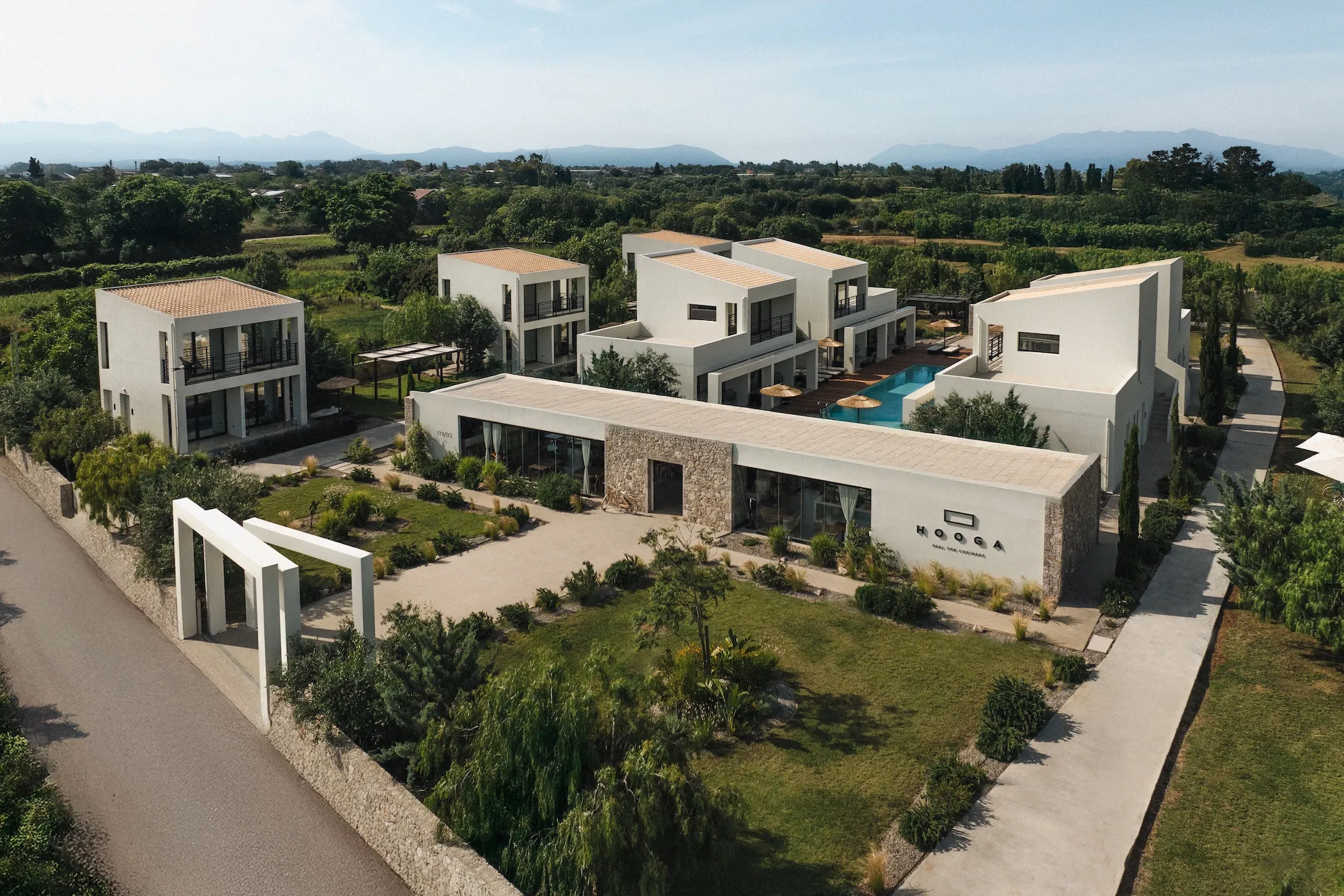
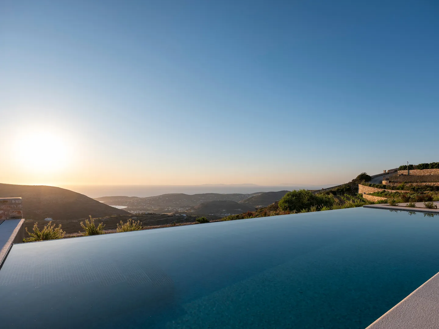
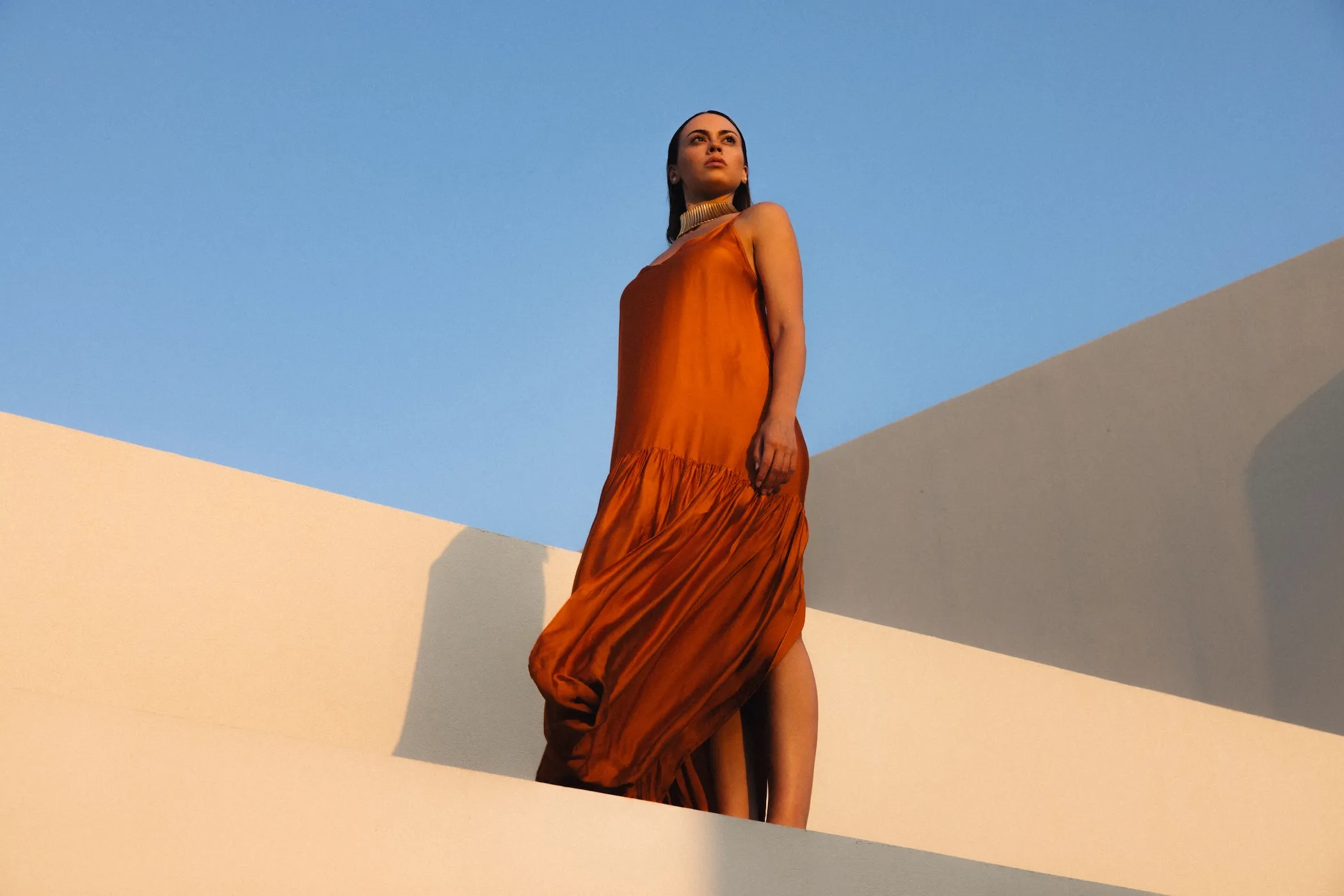
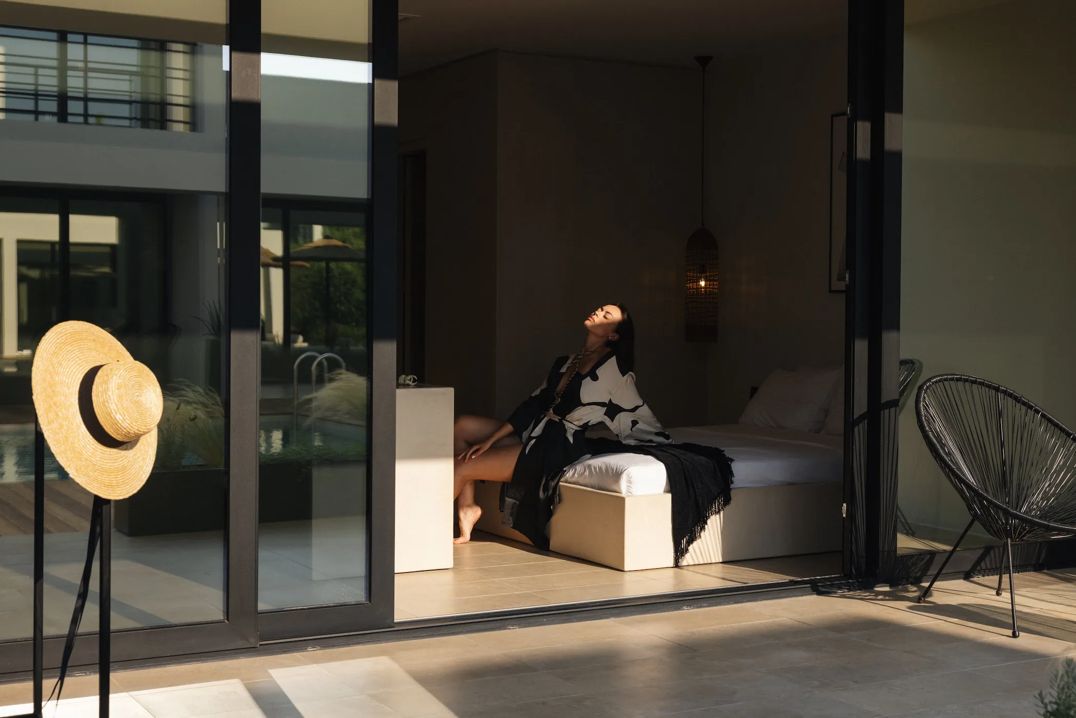
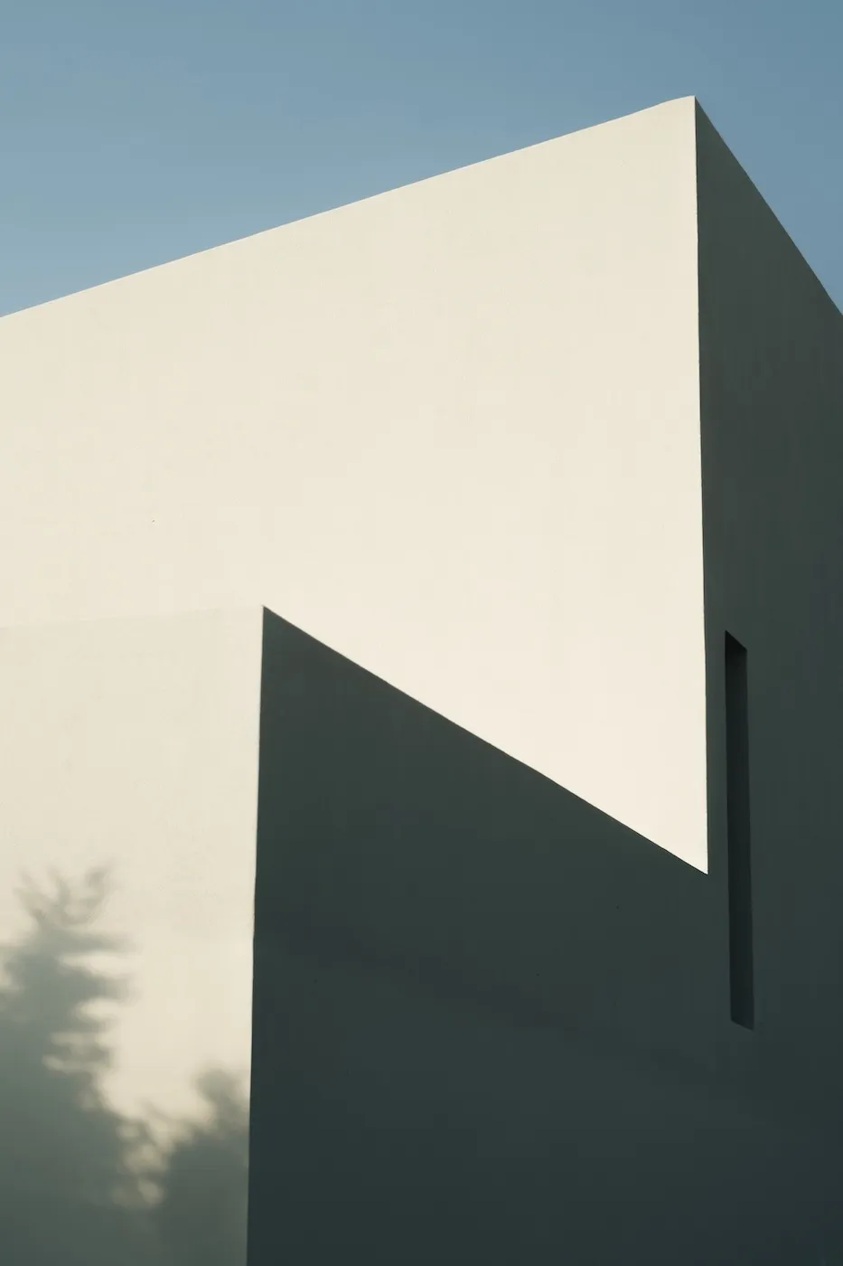
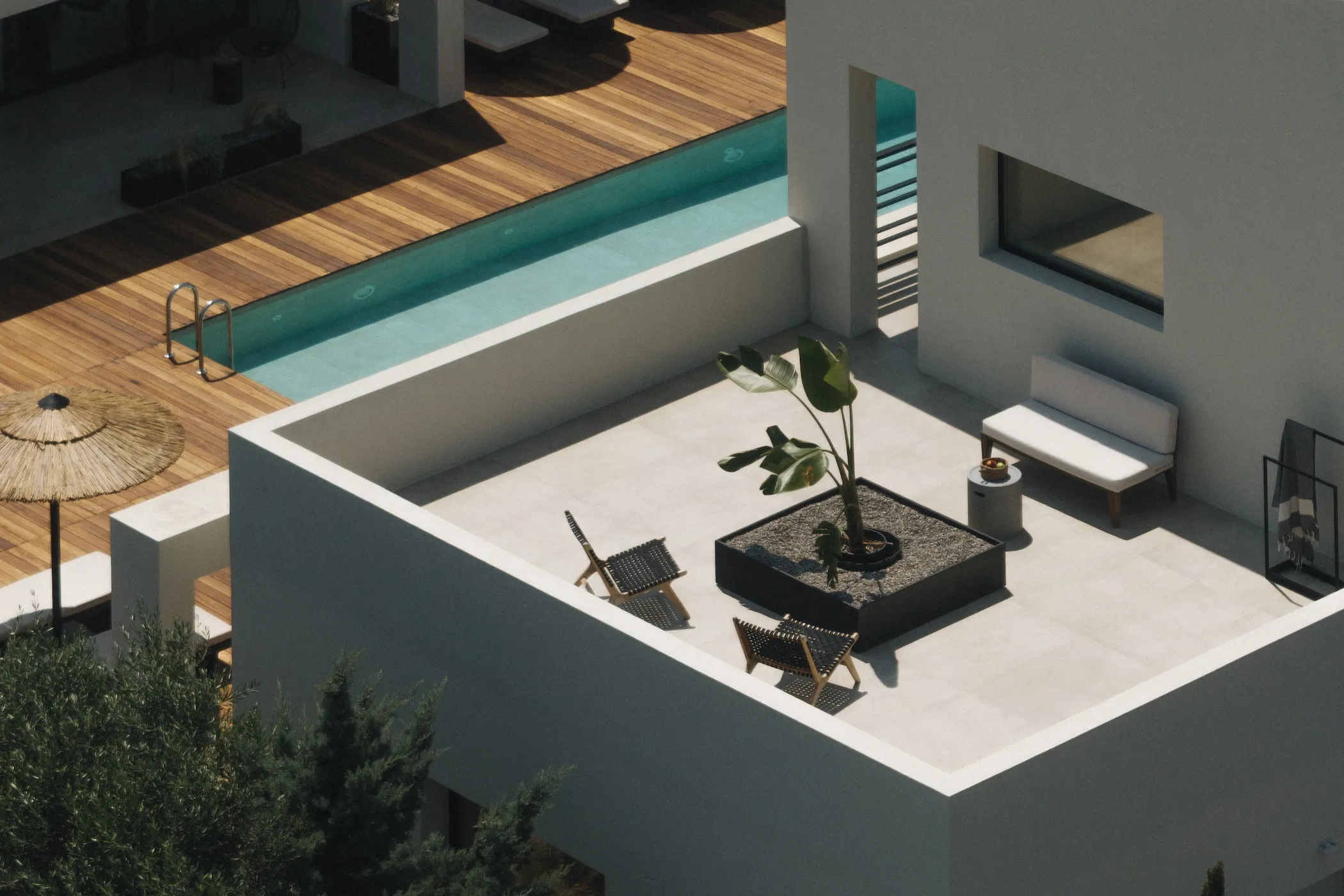
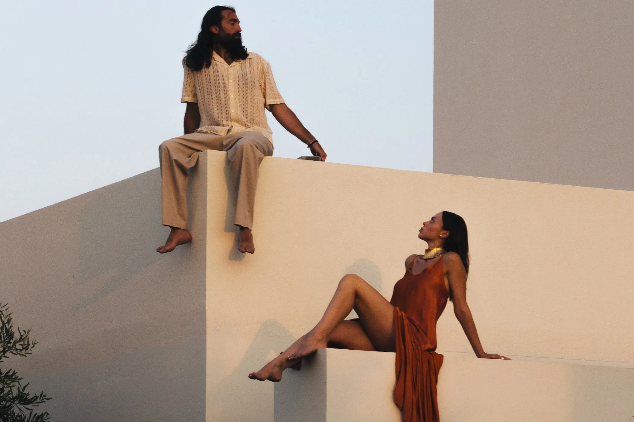
For the photography, our approach departed entirely from traditional hospitality marketing tropes. Guided by an Art Direction deeply influenced by experimental cinema, we focused on mood, shadows, and the interplay of light. Rather than documenting square footage and amenities, we framed cinematic shots that capture time slowing down: the way morning light rests on the linens and the mystique of the space. We didn’t photograph rooms; we photographed the feeling of being there.


hospitality branding

THE TANGIBLE EXPERIENCE


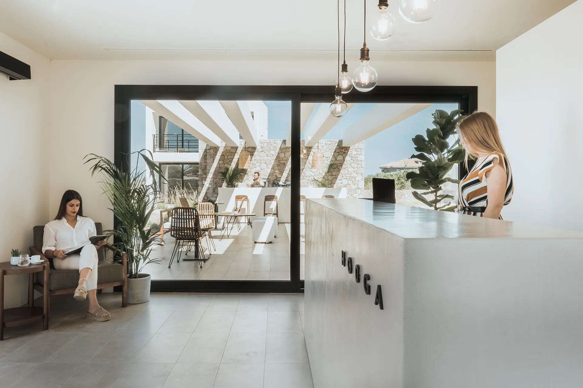
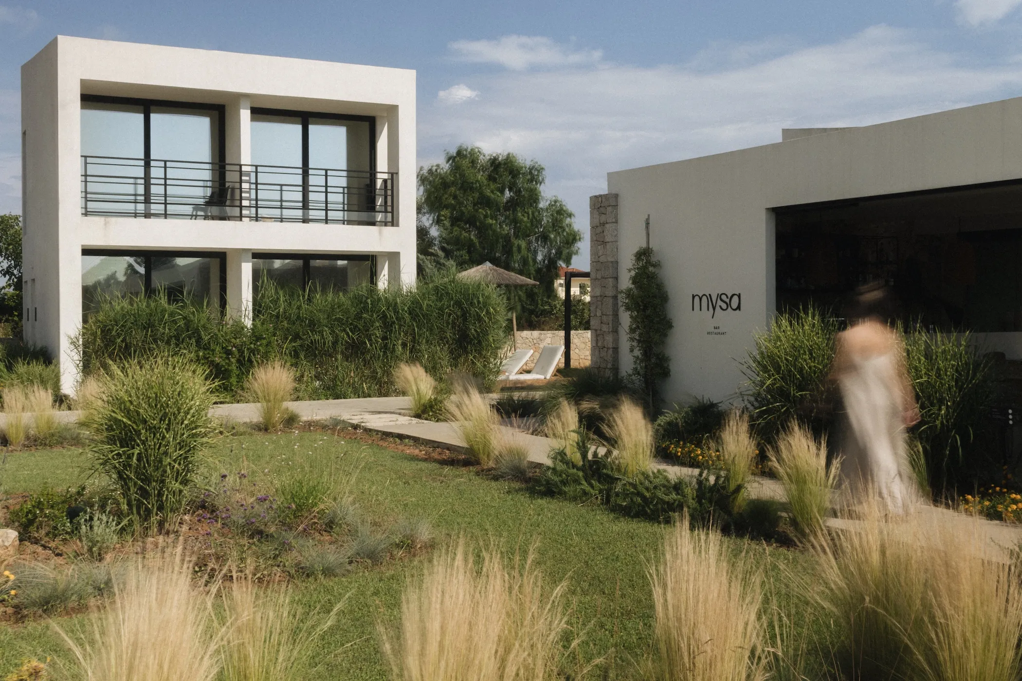
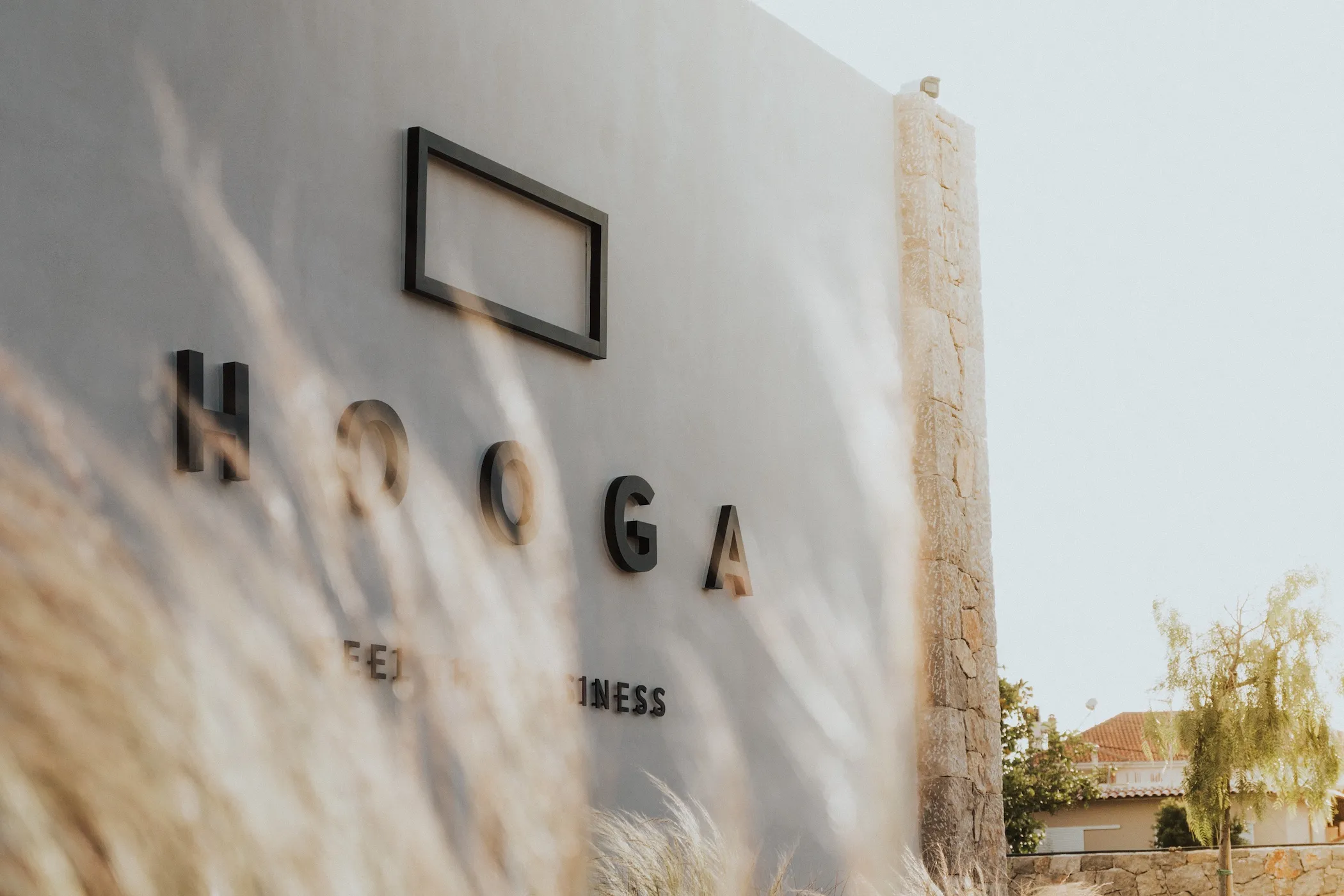
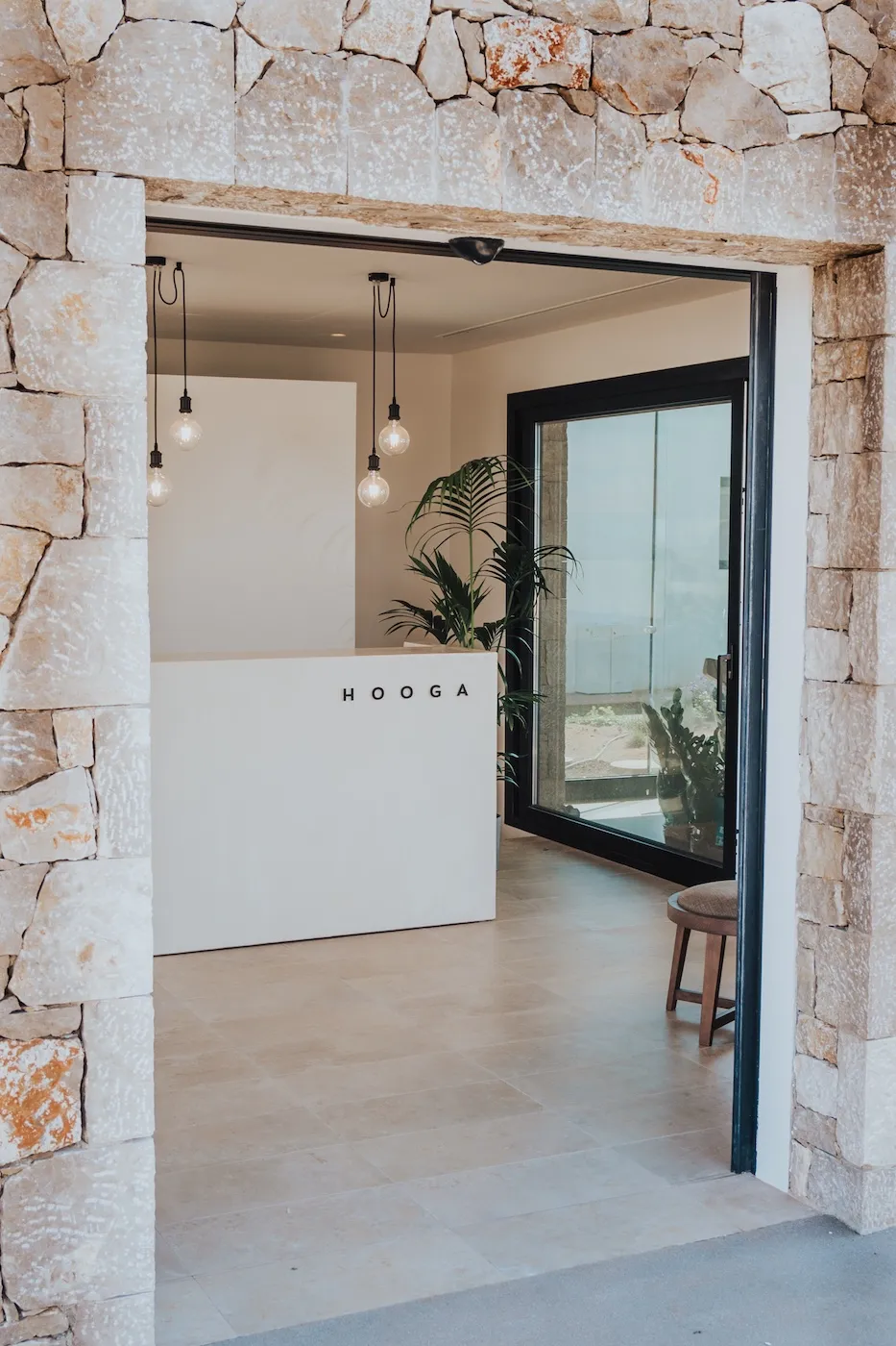
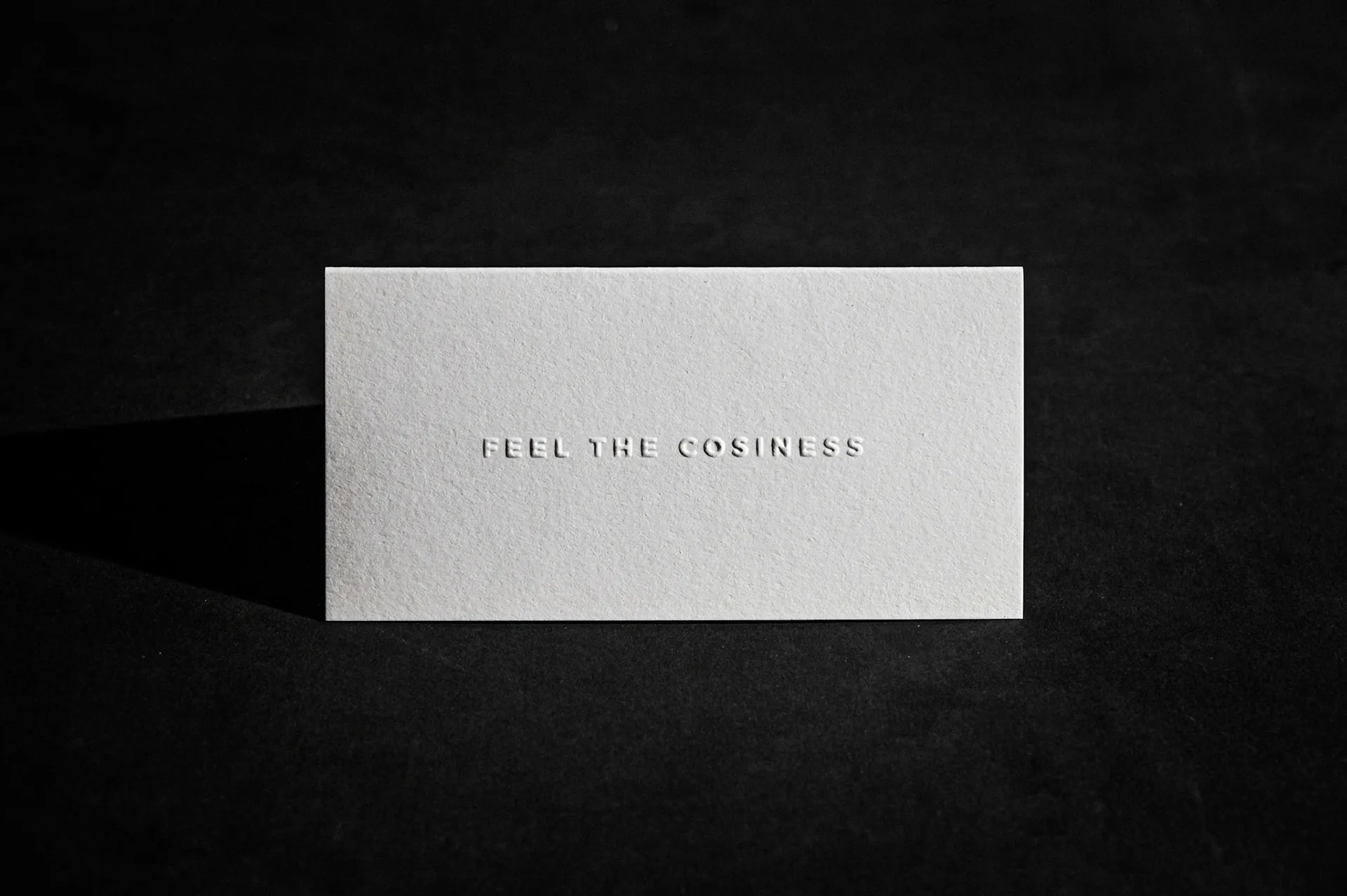
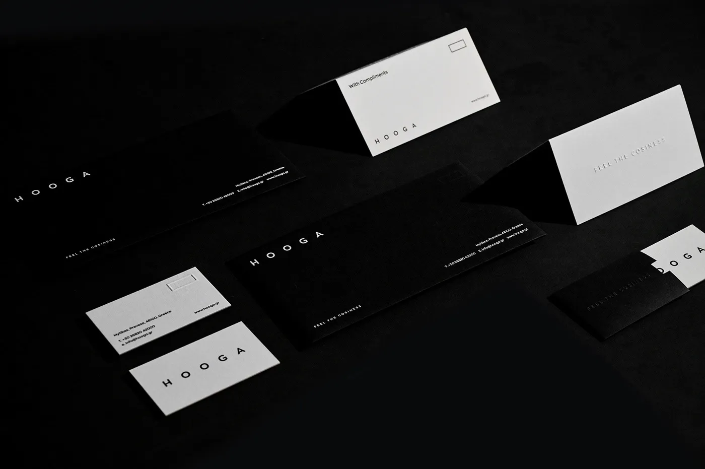
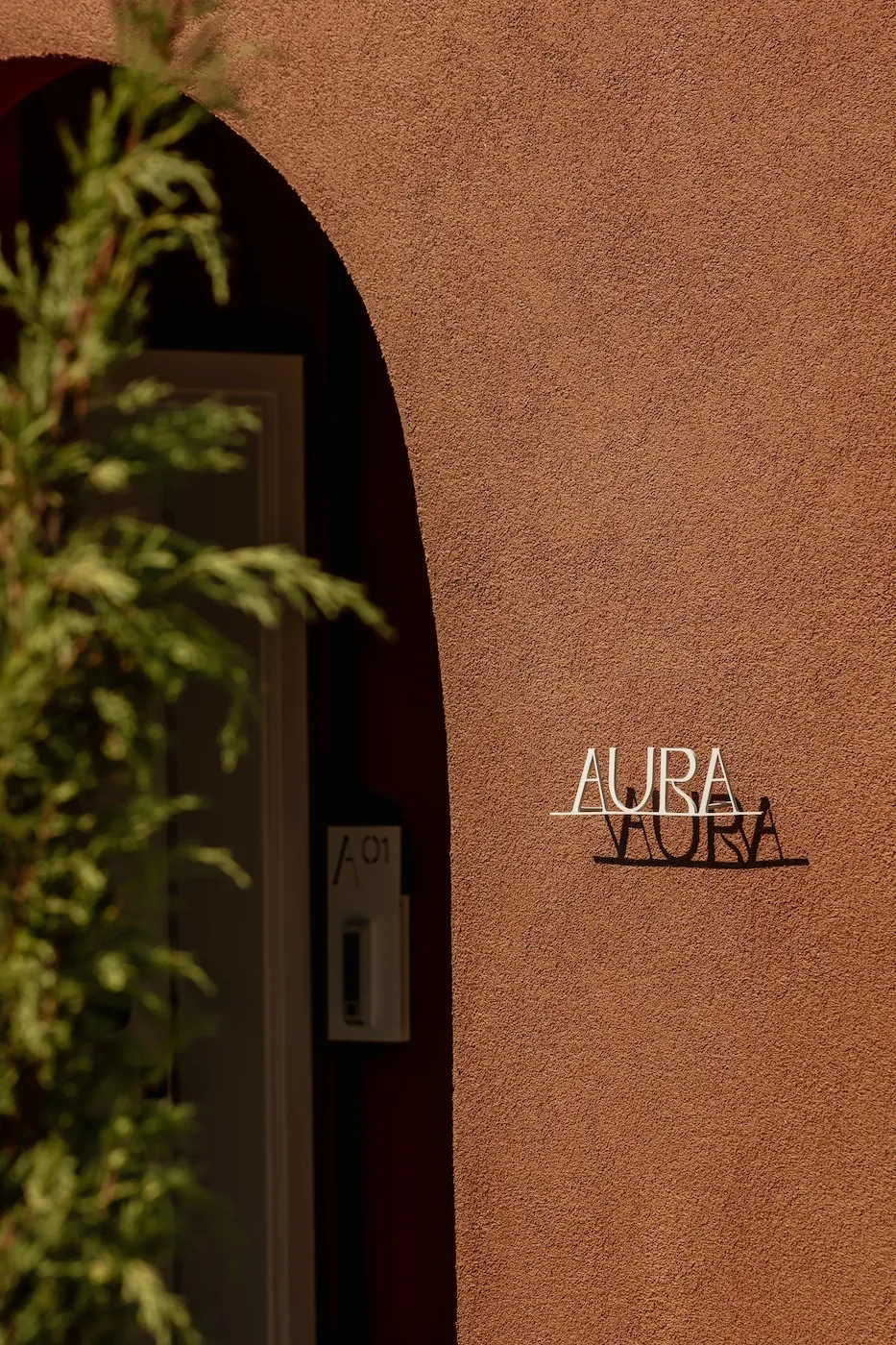
The brand needed to “breathe” within the physical space of the retreat, acquiring texture and weight. The signage was designed with the utmost respect for the architecture, utilizing matte black metal. Simultaneously, the brand collateral and physical touchpoints were printed on premium paper stocks using letterpress techniques. This uncompromising materiality, from the cold touch of metal to the textured paper guests can run their fingers over, creates a seamless dialogue with the stark black-and-white identity, adding a grounded, tactile dimension to the hospitality experience.


σήμανση για το ξενοδοχείο hooga
branding for hooga
hotel signage hooga
σήμανση για το ξενοδοχείο hooga
signage για lobby ξενοδοχείου hooga
εκτύπωση key cards hooga
business cards hotel hooga
hotel signage hooga
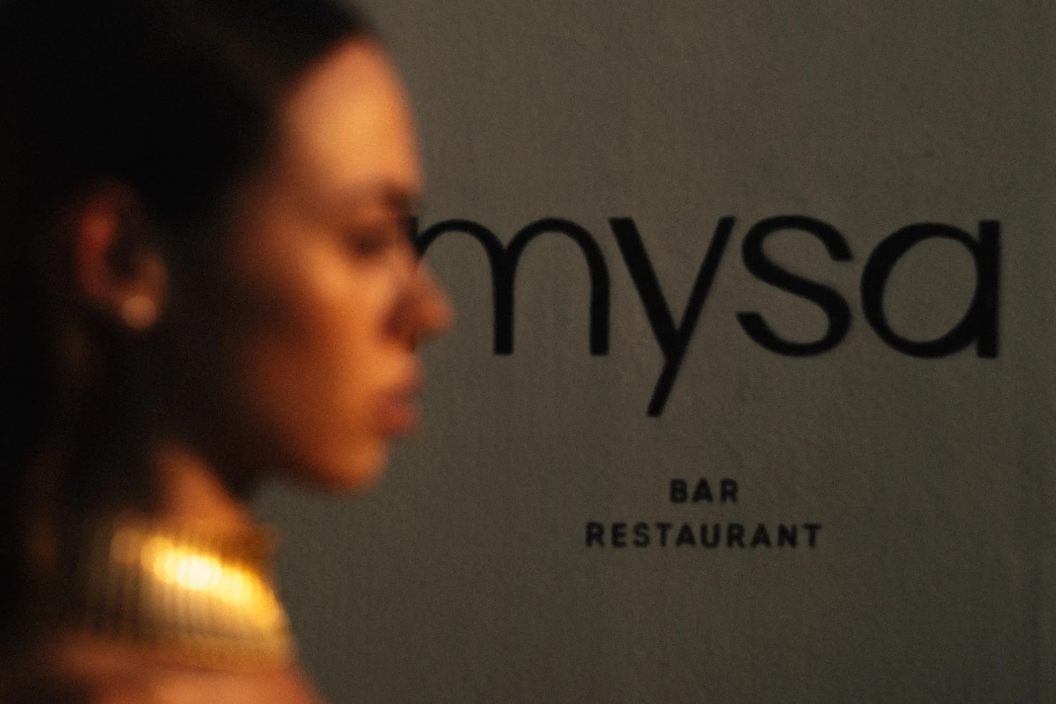
signage mysa by hooga
hooga welldesigned
corporate id for hotel hooga

THE IMPACT


Starting with a blank slate, Hooga was introduced to the public not as just another place to stay, but as a definitive destination. Its digital and physical presence are so deeply aligned that guests experience the intimacy of the space from their very first scroll, arriving at the property with the absolute certainty that they have found exactly the peace they were seeking.


VISIT HOOGA


welldesigned branding hooga

NEXT CASE STUDY

ENQUIRY FORM

Start Your Project

Project Form EN